 Add Row
  Add
Add 


Did you know that over 60% of web traffic now comes from mobile devices? If your website isn’t responsive, you might be missing out on the majority of your potential customers. Responsive web design doesn’t just keep your site looking good—it could be the competitive edge your business needs to grow and thrive. In this comprehensive guide, we’ll unlock what makes responsive design essential, reveal how it drives business results, and provide actionable steps to elevate your digital presence for every device and user.
Revealing the Impact: Why Responsive Web Design Is No Longer Optional
"Over 60% of web traffic comes from mobile devices—a responsive web design is essential, not optional."—Industry Analyst
The explosion of smartphones and tablets has revolutionized how people interact with businesses online. For many brands, the days of desktop-only websites are long gone. Customers expect a fast, seamless experience whether they are browsing on a large monitor, a tablet, or the smallest mobile phone. Investing in responsive web design is no longer a luxury—it's a necessity for any business seeking to attract and retain customers in the mobile-first era. Search engines, including Google, actively reward sites optimized for mobile and responsive behavior, directly impacting your search ranking and visibility. In fact, with so much web traffic originating from mobile devices, websites that fail to deliver a consistent experience across screen sizes face increased bounce rates and lost conversions. Responsive web design isn’t just about aesthetics; it’s a robust design approach that future-proofs your brand, streamlines your web development efforts, and meets your audience wherever they are.
Modern consumers judge your business from their very first interaction with your web page. If it loads awkwardly on their device, with misplaced buttons or hard-to-read text, they’re likely to move on—and quickly. In the context of growing your business, neglecting responsive web design essentially means leaving revenue on the table. Responsive designs ensure your web pages automatically adjust their layout, content, and interactive elements to every screen size, delivering the best possible user experience regardless of device. The bottom line? If you want a website that connects, converts, and competes, making it responsive is no longer optional but absolutely critical.

What You’ll Learn About Responsive Web Design
The definition and principles of responsive web design
How responsive websites drive business growth
Essential responsive design techniques (media queries, fluid grids, and more)
Tools and resources for implementing responsive web design
Expert answers to top questions from business leaders
Understanding Responsive Web Design: Foundations and Principles
What is Responsive Web Design?
At its core, responsive web design is a design approach that ensures your web pages look, feel, and function seamlessly on all devices, from desktops and laptops to tablets and smartphones. Unlike traditional web pages that are fixed in size, a responsive website uses a combination of flexible grid systems, relative units, and media queries to automatically adjust content, images, and navigation menus for any screen size. The site “responds” to the user’s behavior and device environment, providing a consistent, high-quality experience no matter how someone accesses your site.
In today’s digital landscape, visitors expect a site to load quickly, display legibly, and offer intuitive navigation—even on the go. Implementing responsive web design goes beyond merely resizing content. It involves rethinking your entire layout strategy—from font size and images to navigation and call-to-action buttons—so that everything is fully accessible and visually appealing on both large monitors and smaller screens. The ultimate goal? Delivering an experience that’s not just usable, but delightful, for every user on any device.
The Role of Responsive Web Design in Modern Web Development
Responsive web design plays a pivotal role in modern web development by bridging the gap between evolving user expectations and technology. As web traffic diversifies across mobile devices, tablets, and desktops, businesses have realized that building and maintaining separate sites for each device is costly and inefficient. Instead, a single responsive web framework allows developers to create sites that automatically adjust and display optimally on any browser window or device.
This approach not only reduces development and maintenance costs but also significantly enhances the user experience (UX). With a unified codebase and content strategy, you ensure brand consistency, quicker updates, and a more streamlined digital presence. By embracing responsive web design, companies gain agility, staying ahead of trends and technological changes while maximizing their online reach and impact.

Responsive Web vs. Adaptive and Traditional Web Design
It’s important to distinguish between responsive web design and other approaches like adaptive or traditional (fixed-width) web design. Adaptive design uses a set of predefined layouts, serving a specific web page version based on the detected device, while traditional web design creates static layouts optimized solely for standard desktop screens. These older models cannot efficiently cater to the growing diversity of devices and unpredictable screen sizes users now employ.
Responsive web design, meanwhile, leverages CSS media queries, fluid grids, and flexible images to build pages that fluidly scale and rearrange content based on device specifications. This eliminates the need to create and maintain multiple versions of your site, ensuring long-term scalability and a cohesive user interface and user experience everywhere your brand appears online.
Key Components of Responsive Web Design
Media Queries: Achieving Flexibility Across Devices
Media queries form the technological backbone of responsive web design. By using conditional CSS statements, media queries detect properties like screen size, device orientation, and even color capabilities. Once a query evaluates to true (e. g. , if the browser window width is less than 600px), it applies specific styles that optimize your web page for that scenario. Practical adjustments often include resizing text, stacking columns vertically, or showing a mobile-friendly navigation menu.
The strategic use of media queries empowers developers to serve the right design and layout to every user without needing a separate mobile site. This adaptability is why great responsive designs look and function beautifully on everything from the smallest smartphone to large desktop monitors. Web developers rely on media queries to ensure sites react fluidly to users’ needs, creating consistent, high-quality digital experiences for every device.

Fluid Grids and Layouts in Responsive Web Design
A fluid grid system uses relative sizing instead of fixed pixel values to create layouts that resize smoothly for any screen size. By employing percentage-based widths or relative units like “em,” “rem,” or “vw/vh,” content can reflow from a multi-column desktop layout to a single-column mobile view without visual distortion. This flexibility is essential for modern, adaptive web pages, ensuring content always fits in the available space, regardless of device.
Implementing a fluid grid typically involves breaking the page structure into columns or blocks that scale according to the container’s dimensions. Combined with the width property in CSS, these grids prevent horizontal scrolling and ensure a highly functional, visually appealing experience. The end result is a site that feels purpose-built for every viewer, driving engagement and reducing frustration.
The Power of Flexible Images and Media Elements
Large images and rigid media files can break layouts and slow websites to a crawl on mobile networks. Responsive web design uses flexible images and media elements that scale, crop, or swap source files based on the user’s screen size and device resolution. Setting the max-width property to 100% in CSS ensures images don’t overflow their containers but instead shrink or expand as needed.
Combined with responsive image formats (like WebP) and the srcset attribute, you can deliver images optimized for every device, balancing quality and speed. This technique keeps load times down and displays clear, crisp visuals—an essential piece for both user experience and e-commerce performance.
Implementing Responsive Design with Viewport Meta Tag
The viewport meta tag is a critical tool in enabling responsive web pages to adapt seamlessly to various devices and browser windows. Placed in the head section of your HTML, it tells mobile browsers how to adjust your site’s dimensions and scaling, allowing CSS media queries and fluid layouts to work as intended. The most common implementation is: .
Without this tag, even the most carefully built fluid grid or media query setup can falter on mobile devices. The viewport meta tag is essential for ensuring that your website displays and performs optimally, matching the device’s screen size, and preventing awkward zooming or scrolling for users on smartphones and tablets.
Core Steps: How to Make a Responsive Website
Plan your web design with mobile users in mind
Use media queries for adaptability
Utilize fluid grid systems and width properties
Include viewport meta tags for device targeting
Test and iterate your responsive web pages
The process to make web pages responsive begins at the planning stage—always design for mobile first, then scale up for tablets and desktops. Incorporate media queries to adjust styles, employ a fluid grid system for adaptable layouts, use the viewport meta tag to manage device scaling, and rigorously test your responsive website on a range of devices and browsers. With these steps, your site not only meets modern standards but anticipates future technological shifts.

Benefits of Responsive Web Design for Business Growth
"A well-executed responsive website can reduce bounce rates and improve conversions by up to 30%."—Digital Marketing Specialist
The benefits of responsive web design go far beyond creating a visually pleasing web page. At the business level, responsive design impacts everything from user engagement and conversion rates to search engine performance and brand reputation. By ensuring your website automatically adjusts to all devices, you welcome more visitors, encourage longer browsing sessions, and foster trust among your audience. Responsive sites are more likely to keep users engaged, reduce frustration, and lead to higher conversion rates—directly fueling business growth.
Additionally, search engines prioritize websites that deliver seamless, device-agnostic experiences. Google’s mobile-first indexing means responsive sites consistently rank higher, driving more organic traffic and qualified leads your way. The cost savings are also considerable: instead of building multiple separate versions, you maintain a single, adaptive website, simplifying updates and freeing up resources for innovation and marketing.
How Responsive Web Design Enhances User Experience (UX)
User experience (UX) is at the heart of responsive web design. Sites that are easy to navigate, fast to load, and visually consistent inspire confidence, keeping visitors engaged longer. Responsive design ensures the most important content and calls-to-action are always front and center, regardless of screen size.
A responsive website also reduces friction during checkout, registration, or lead capture processes, making it easier for users to convert. When your brand provides a smooth experience across every device, customers are more likely to return—and recommend your business to others.

SEO Advantages of Responsive Website Architecture
Search engines prefer responsive websites because they offer a single, unified codebase and consistent content across devices. This eliminates potential issues with duplicate content—which can arise when running separate desktop and mobile sites—and simplifies ongoing SEO efforts.
Additionally, responsive web design improves page speed and reduces bounce rates, both key ranking factors for Google and Bing. With a single URL structure, all SEO value (such as backlinks) flows to one site, further strengthening your visibility. If climbing the ranks in search engine results is important, a responsive site is the most direct path to achieving that goal.
Cost Efficiency vs. Maintaining Multiple Sites
Maintaining separate web designs for desktop, mobile, and tablet quickly becomes expensive and time-consuming. Every update, bug fix, or new feature requires duplicate efforts, increasing costs and the risk of inconsistency. Responsive web design eliminates this challenge by consolidating your digital efforts into a single, adaptable platform, making it easier to manage, update, and scale.
A responsive website results in a better return on investment, minimizing long-term expenses and enabling your business to quickly adapt to future device trends—for instance, foldables or new screen resolutions—without rebuilding from scratch.
Responsive Web Design and the User Journey
Optimizing for Mobile and Desktop Users
Modern user journeys are multi-device by default—customers might start searching for your company on their smartphone, research deeper on a tablet, and complete a purchase on their desktop. Responsive web design ensures that this experience remains frictionless every step of the way. By delivering consistent content and intuitive navigation, you prevent confusion and lost sales, regardless of how users move along their purchase path.
With responsive web design, visitors encounter the same branding, messaging, and user interface whether they’re on the go or at their desk. This reliability fosters trust in your brand and reduces the cognitive load for users, making conversion actions—like shopping, filling out forms, or contacting you—effortless and inviting.
Improving Accessibility with Responsive Web Pages
Accessibility is a key pillar of responsive web design. Enabling users of all abilities and backgrounds to navigate and consume your site shouldn’t be an afterthought. Responsive design—when combined with web accessibility best practices—ensures that elements like font size, clickable buttons, and navigation menus are appropriately sized and reachable for everyone, whether they use a touchscreen, keyboard, or assistive technology.
By ensuring your site works on a variety of screen sizes, increasing contrast for readability, and making sure content reflows logically, responsive web design expands your audience and improves customer satisfaction.
Consistency and Branding in Responsive Design
Consistent branding is critical for building trust online. Responsive web design guarantees that your color palette, logos, icons, and message hierarchy appear perfectly and instantly recognizable across all devices and browsers. Users will immediately associate your site with reliability and professionalism, reinforcing loyalty and encouraging word-of-mouth recommendations.
With a responsive website, you control every aspect of the customer journey—from their first impression to post-purchase follow-ups—without risking a fractured or frustrating experience.
Technical Considerations: Coding Effective Responsive Web Designs
Best Practices for Implementing Media Queries
To unlock the full potential of media queries, start with a mobile-first approach—define your base styles for the smallest screens, then add complexity as you scale up using min-width breakpoints. Target common device widths (such as 320px, 768px, and 1024px), but also account for a wide range of screen sizes and dimensions.
Use em or rem units for breakpoints tied to font size, supporting better scalability when users change their browser settings. Group related queries to prevent style conflicts, and avoid over-engineering by focusing on key breakpoints most relevant to your target audience.
Harnessing the Power of the Width Property and Flexible Layouts
The width property in CSS is central to fluid, flexible layouts. Using percentage-based values—rather than fixed pixels—allows containers, columns, and images to scale with the viewport width. Combined with flexible grids, CSS Flexbox, or CSS Grid, you can create layouts that adapt to virtually any device or browser window.
Apply max-width limits to maintain readability on very large screens, and leverage min-width properties for accessibility on smaller phones. The result is a web page that remains usable, attractive, and effective under any conditions.
Testing Responsive Web Pages Across Devices
Comprehensive testing is vital for success. Use real devices when possible, as emulators and simulators can miss subtle issues like touch interactions or device-specific browser quirks. Online tools such as BrowserStack, Responsinator, or Chrome DevTools device mode enable you to preview and troubleshoot your site across dozens of device profiles and screen sizes.
Test all interactive elements, forms, and navigation components thoroughly. Verify that content reflows correctly, images scale lazily for performance, and accessibility features work on every device. Regular, detailed testing leads to a resilient and reliable responsive website.
Case Studies: Successful Responsive Design Websites in Action
Examples from Leading Brands Using Responsive Web Design
Top brands recognize the value of responsive web design to drive customer engagement and business growth. For example, Brand A implemented fluid grids and flexible images, resulting in a 25% increase in session duration. Brand B took a mobile-first approach with viewport meta tags and adaptive layouts, achieving an 18% uplift in conversions. These case studies showcase how strategic implementation of responsive web design principles can directly contribute to measurable business outcomes.
Industry leaders across e-commerce, SaaS, and education consistently employ responsive web design to provide seamless cross-device experiences, build trust, and maximize digital ROI. Their experiences underline the importance for any business serious about online growth to follow suit.

Brand |
Responsive Web Features |
Results |
|---|---|---|
Brand A |
Fluid grids, flexible images |
+25% session duration |
Brand B |
Viewport meta tags, mobile-first layout |
+18% conversions |
Lists: Essential Tools and Resources for Responsive Web Design
Top CSS frameworks for responsive design
Online responsive web testing tools
Code generators for media queries and grids
These resources empower web developers to streamline workflows and ensure their responsive sites meet industry standards. CSS frameworks like Bootstrap or Foundation offer robust grid systems and prebuilt components; testing tools such as BrowserStack or Responsinator allow multi-device previews, while online generators simplify the creation of custom media queries and adaptable grid layouts.
People Also Ask: Responsive Web Design FAQs
What is responsive web design?
Responsive web design is an approach to web design that ensures web pages display optimally on all devices and screen sizes by adapting their layout using flexible grids, media queries, and flexible media.
How do I make my website responsive?
You can make your website responsive by using media queries, fluid grids, flexible images, and the viewport meta tag to adapt website content to various devices and resolutions.
Is responsiveness UI or UX?
Responsiveness impacts both UI (User Interface) and UX (User Experience), ensuring interfaces are accessible and pleasant across all platforms and device types.
What is an example of a responsive design website?
An example of a responsive website is Apple. com, which fluidly adapts its layout and images based on the user’s device, providing a cohesive and efficient browsing experience.
Expert Answers: Responsive Web Design FAQs for Business Owners
Does responsive web design affect search engine ranking?
How does responsive design improve customer satisfaction?
What are the top mistakes to avoid when designing responsive websites?
Responsive web design significantly affects search engine ranking—Google and Bing both prioritize mobile-friendly, responsive sites. Customer satisfaction improves as users encounter seamless functionality, faster load times, and easier navigation. Key mistakes to avoid include neglecting the viewport meta tag, using fixed-width layouts, and overlooking real device testing.

Key Takeaways for Business Leaders Investing in Responsive Web Design
Responsive web design is crucial for business growth in the mobile-first era
Key techniques include media queries, fluid grids, and viewport meta tags
Responsive web design amplifies user experience, SEO, and brand consistency
Final Thoughts: Is Responsive Web Design the Breakthrough Your Site Needs?
Responsive web design isn’t just a trend—it's a proven catalyst for better engagement, higher SEO rankings, and real business growth. Adopting a responsive approach sets your business up for success as technology and user habits continue evolving.
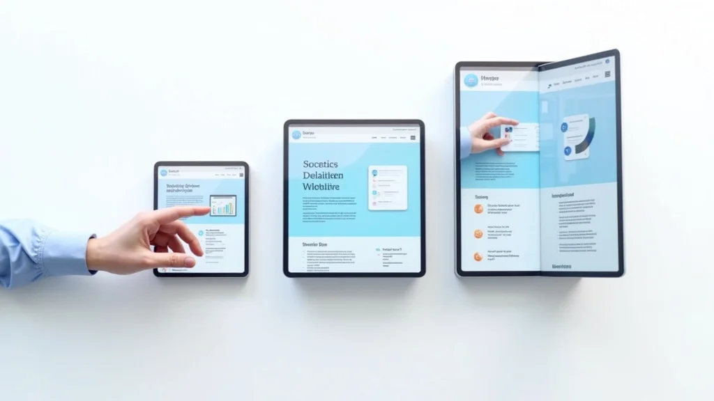
Watch how web pages transform seamlessly between desktop, tablet, and mobile—demonstrating real-time responsive design for business growth.
Ready to Transform Your Business? Schedule a Meeting to Optimize Your Website’s Responsive Web Design
Take the next step in business growth. Schedule a Meeting today to unlock the full potential of responsive web design for your business.
Sources
To deepen your understanding of responsive web design, consider exploring the following resources: “Responsive Web Design”: This comprehensive article introduces the principles of responsive web design, emphasizing the importance of fluid grids, flexible images, and media queries in creating adaptable web pages. (responsivewebdesign. com) “Responsive Web Design”: This resource provides an in-depth look at responsive web design, detailing how it ensures websites automatically adapt to different screen sizes, offering a smooth and user-friendly experience across all devices. (geeksforgeeks. org) If you’re serious about enhancing your website’s adaptability and user experience, these resources will provide valuable insights and practical guidance.


Write A Comment